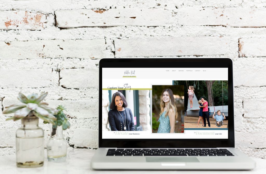
This past fall I decided to update my website. My previous website was one that I created myself (it was an upgrade from another site I had) and it served me well for the last 6 years but I was ready for a change. I wanted a new look, easier navigation and more customized graphics and most of all I wanted help in designing and creating it.
I must admit that deciding to hire someone to take on this task was not easy for me. I really try and do most things myself but realized that if I wanted a more professional looking site, I needed to hire someone who was a professional in this field. Much like how I preach that you need to invest in yourself for quality photos, I realized that I needed to invest in myself in order to have a website that had form, function and beautiful design. It was time to admit this was out of my wheelhouse and my business was worth this investment.
So I took to the internet and researched my options regarding website platforms and web designers. I was using a ProPhoto WordPress theme and realized after looking at the pros and cons of switching to Squarespace or Showit that it was best for me to stick with ProPhoto. Once I made my decision on staying with my original platform, I began the search for a web designer and found a terrific designer, Melissa Mitchell who specializes in ProPhoto themes. We had a Skype interview that enabled me to get a better sense of not only her work but also her personality and I knew she was the perfect person for the job.
I thought I’d share with you the steps I took to updating my site and hopefully it will help you if you plan on tackling this type of endeavor. I’m so happy with how my website turned out and I’m really glad I hired someone to guide and bring my ideas to life.
- Research Platforms/Hosting Sites: As I mentioned, I did some research into different platforms. I wanted something that would be easy to update on my own and that would not be a big investment. Since I was already familiar with ProPhoto and had already invested in a hosting site and the ProPhoto theme, I decided to stick with them. Other popular platforms are Squarespace and Showit. Both are supposedly very easy to navigate and update on your own.
- Find a Designer: I had received some referrals from friends but some of the designers were either out of my budget range or were not able to start my project right away. I was itching to get my project going so I ended up finding Melissa on my own but it totally worked out. She was great! I was happy to find someone who designed using ProPhoto and who had an easy going, helpful vibe as well as a great aesthetic. The key element for me was her personality. I really wanted to work with someone who not only had great ideas but was easy to work with and Melissa was all that and more.
- Determine Your Focus/Goals: Other than a fresh look, I knew I wanted my website to focus on three main areas of my business high school seniors, personal brand photography and families. To be honest, I thought I was only going to focus on branding and seniors but realized as I was working on the site, that I wasn’t quite ready to let go of the family portrait aspect of my business. On my previous site, I had every genre of photography you could think of listed (except for weddings) and I realized that it just seemed like too much. I needed to decide what was it I wanted to focus on and create a site around those areas.
- Determine Your Brand/Values: This is tougher than you might think. I had a 30 minute brand strategy call with Erin from Women on A Mission who really helped me start to think about what it was I wanted to convey on my site. How was I going to differentiate myself from the sea of photographers out there? What I realized is the key differentiator of what I do is that I do it…..I AM the factor. Now I’m not saying this to sound vain but it is my style and approach that makes me unique (as well as anyone out there) and that is what I needed to share. So you’ll see on my site, there is more information that relates to me. My photo is on the front page of the site, I incorporated more behind the scenes photos to show people what it is like to work with me and I tried to infuse a little more of my personality on my about page.
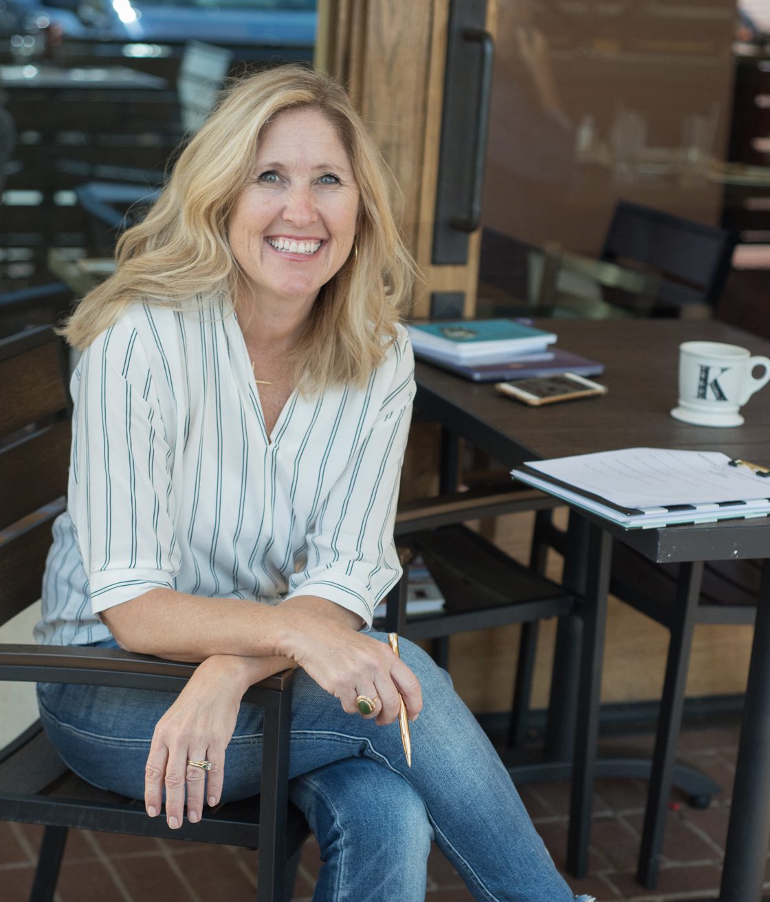
- Invest in Photos: This directly relates to #4 above. No matter what type of business you have you need quality photos of yourself and your product. Hiring a photographer to help capture images that show who you are and what you do are so important and will really make a difference in helping you to connect with your ideal client (I have a branding checklist that you can download here). In my case I worked with a fellow photographer Jen Vazquez who captured my headshots as well as some of the behind the scenes photos you see on my site.
- Find Your Aesthetic: This is a lot of fun but also very overwhelming. I found it really hard to narrow down what kind of look I wanted. I knew overall I wanted something clean and minimalistic but I also wanted to have a modern feel with a chic vibe. I looked at A LOT of websites for inspiration, paying attention to colors, fonts, and layouts. I created a private Pinterest board of all these design ideas and shared this with Melissa. She did a fabulous job taking my board of numerous pins and really summed up what I was looking for, on the first try no less.
- Think Through the Navigation: After reading several blog posts regarding website design and talking with Melissa, I knew that I needed to make my site easier to navigate. Visitors do not want to click all over the place to get to where they are going. So we made my site very simple to navigate whether on a desktop or mobile device. On every page you’ll see that we incorporated all the information a user would need including details such as pricing, what’s involved, sample images and a way to get in contact.
- Curate Your Content: Now is the time to go through your content and showcase only your best work or work that represents your business focus. For me that meant leaving a few galleries behind and narrowing down as well as updating the galleries I would be featuring. I also wanted to pick images that not only showcased some of my favorite work but also fit with my overall color scheme and aesthetic.
- Don’t Forget About Your Blog: This was another area that needed some fine tuning. In the past I had numerous categories and many duplicate variations. My blog was also not very easy to search. So with Melissa’s help we narrowed down the categories and came up with a design that makes it easier for users to not only see current posts but also find useful past content.
- Test the Site Before Launching: I’m so glad I sent the site to a few friends to preview. I didn’t realize that on certain browsers the custom font I chose went all wonky and was totally out of whack. On my Safari browser it looked fine but on Chrome or Firefox the cute fonts I chose defaulted to a basic font that was huge and threw everything off. The fix was not an easy one but my designer, Melissa was a super sleuth and along with the team from ProPhoto, was able to figure out the issue and solution.
- Pat Yourself on the Back and Share Your Site: Ok, so I guess this is 11 tips…this one can’t be missed….When you are done with this process, which typically takes a month or two, it is time to celebrate and share your site on all your social media platforms. Take pride in the time and effort it took to create your home on the web.
I’d love to work with you if you are in need of images for your new website or website redesign. If you’d like a free checklist on what types of images you might want to consider including on your website please click here. Or if you’d like to schedule a free 30 minute consultation to chat about images for your website, please feel free to email me at hello@kristinarustphotogrpahy.com or fill out my contact page.

